

When a deeply nested component needs behavior that varies by context, passing callback props through every layer creates a maintenance problem. Inversion of Control (IoC) solves this: instead of the nested component owning its behavior, the parent or grandparent provides it via a render function passed through Context API. The nested component stays generic; the consumer decides what it renders.
As components and functionality grow, maintaining and extending a component's functionality becomes much more complex. This is especially the case for large components that utilise other components to provide specific features. In this article, we will cover how to extend the functionality of a deeply nested component by taking advantage of Inversion of Control (IoC) and utilising the Context API to inject JSX.
The code for this tutorial can be found in this GitHub repository. Below you can find an interactive Stackblitz example.
What's Inversion of Control (IoC)?
Inversion of Control (IoC) is a principle in software design that makes it easier to decouple things by inverting the control flow of a program. I know this sentence will probably mean nothing to most people and leaves them scratching their heads. Basically, when applied to React, IoC is a way to build components that are flexible and easy to customise. Let's not focus too much on theory; instead let's do some coding and it should be clearer what IoC is about.
Contrived Example Setup
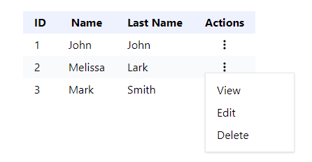
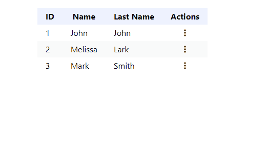
We will set up a simple, contrived code example to demonstrate how to implement components using the IoC principle and inject JSX using Context API. Let's say we have a generic Table component that renders a list of rows and columns. Each row has an actions column that contains a menu button that opens a dropdown menu with a few actions, such as View, Edit, and Delete. The rendering flow is as follows:
- The
Tablecomponent loops through the rows and renders theTableRowcomponent. - The
TableRowcomponent loops through columns and renders theTableColumncomponent. - The
TableColumncomponent renders column text orTableColumnActionscomponent if the current column isActions.
The image below shows what it looks like.
Let's create a simple Table component for the purpose of this tutorial. I've seen implementations like this one a few times in the past, so it should be suitable for this example. If you would like to follow along, you can create a new React project using Vite.
First, we have a file with table options.
src/tableOptions.js
export const tableOptions = {
  headers: ['ID', 'Name', 'Last Name', 'Actions'],
  rows: [
    {
      id: '1',
      columns: [
        {
          column: 'ID',
          text: '1',
        },
        {
          column: 'Name',
          text: 'John',
        },
        {
          column: 'Last Name',
          text: 'John',
        },
        {
          column: 'Actions',
          text: '',
        },
      ],
    },
    {
      id: '2',
      columns: [
        {
          column: 'ID',
          text: '2',
        },
        {
          column: 'Name',
          text: 'Melissa',
        },
        {
          column: 'Last Name',
          text: 'Lark',
        },
        {
          column: 'Actions',
          text: '',
        },
      ],
    },
    {
      id: '3',
      columns: [
        {
          column: 'ID',
          text: '3',
        },
        {
          column: 'Name',
          text: 'Mark',
        },
        {
          column: 'Last Name',
          text: 'Smith',
        },
        {
          column: 'Actions',
          text: '',
        },
      ],
    },
  ],
}
As you can see, the table will have four columns and three rows.
src/App.jsx
import './App.css'
import { tableOptions } from './tableOptions'
import Table from './components/table/Table'

function App() {
  const onViewData = column => {
    alert(`On View Column ${column.column}`)
  }
  const onEditData = column => {
    alert(`On Edit Column ${column.column}`)
  }
  const onDeleteData = column => {
    alert(`On Delete Column ${column.column}`)
  }

  return (
    <div className='container mx-auto py-8'>
      <h1 className='text-center font-semibold text-lg'>
        React Enterprise Component Patterns - JSX Injection via Context API
      </h1>
      <main className='mt-8 flex justify-center'>
        <Table
          options={tableOptions}
          onViewData={onViewData}
          onEditData={onEditData}
          onDeleteData={onDeleteData}
        />
      </main>
    </div>
  )
}

export default App
The App component renders the Table component that receives 4 props:
options- The configuration for rows and columns.onViewData- The function that is executed when theViewmenu option is clicked.onEditData- The function that is executed when theEditmenu option is clicked.onDeleteData- The function that is executed when theDeletemenu option is clicked.
Next, let's create components for the table.
src/components/table/Table.jsx
import TableRow from './components/TableRow'

const Table = props => {
  const { options, onViewData, onEditData, onDeleteData } = props
  const { headers, rows } = options
  return (
    <table>
      <thead>
        <TableRow header columns={headers} />
      </thead>
      <tbody>
        {rows.map(row => {
          return (
            <TableRow
              columns={row.columns}
              key={row.id}
              onViewData={onViewData}
              onEditData={onEditData}
              onDeleteData={onDeleteData}
            />
          )
        })}
      </tbody>
    </table>
  )
}

export default Table
The Table component utilises the TableRow component for table headers and the rows array.
src/components/table/components/TableRow.jsx
import TableHeader from './TableHeader'
import TableColumn from './TableColumn'

const TableRow = props => {
  const { columns, header, onViewData, onEditData, onDeleteData } = props
  const CellComponent = header ? TableHeader : TableColumn
  return (
    <tr className='even:bg-gray-50 hover:bg-blue-50'>
      {columns.map((column, idx) => {
        return (
          <CellComponent
            key={idx}
            column={column}
            onViewData={onViewData}
            onEditData={onEditData}
            onDeleteData={onDeleteData}
          />
        )
      })}
    </tr>
  )
}

export default TableRow
The TableRow component loops through the columns array and renders the CellComponent element, which can be either the TableHeader or TableColumn.
src/components/table/components/TableHeader.jsx
const TableHeader = props => {
  return <th className='px-4 py-1 bg-indigo-50'>{props.column}</th>
}

export default TableHeader
The TableHeader component just renders the th element with some styles.
src/components/table/components/TableColumn.jsx
import TableColumnActions from './TableColumnActions'

const TableColumn = props => {
  const { column, onViewData, onEditData, onDeleteData } = props

  return (
    <td className='px-4 py-1'>
      {column.column === 'Actions' ? (
        <TableColumnActions
          column={column}
          onViewData={onViewData}
          onEditData={onEditData}
          onDeleteData={onDeleteData}
        />
      ) : (
        column.text
      )}
    </td>
  )
}

export default TableColumn
The TableColumn component renders a td element with either the column text or the TableColumnActions component if the column name matches Actions. Normally, this would be done in a different way, but it's fine for our contrived example.
src/components/table/components/TableColumnActions.jsx
import { useState, useRef } from 'react'
import useOnClickOutside from 'use-onclickoutside'
import { IoEllipsisVerticalSharp } from 'react-icons/io5'
import styles from './TableColumnActions.module.css'

const TableColumnActions = props => {
  const { column, onViewData, onEditData, onDeleteData } = props
  const popupRef = useRef(null)
  const [openActions, setOpenActions] = useState(false)
  useOnClickOutside(popupRef, () => setOpenActions(false))
  return (
    <div className='relative'>
      <div className='flex justify-center'>
        <button className='cursor-pointer' onClick={() => setOpenActions(true)}>
          <IoEllipsisVerticalSharp />
        </button>
      </div>
      {openActions ? (
        <div
          className='absolute bg-white shadow border border-gray-200 z-50 min-w-[8rem]'
          ref={popupRef}
        >
          <ul className={styles.actionsMenu}>
            <li>
              <button
                className={styles.actionsMenuButton}
                onClick={() => {
                  setOpenActions(false)
                  onViewData(column)
                }}
              >
                View
              </button>
            </li>
            <li>
              <button
                className={styles.actionsMenuButton}
                onClick={() => {
                  setOpenActions(false)
                  onEditData(column)
                }}
              >
                Edit
              </button>
            </li>
            <li>
              <button
                className={styles.actionsMenuButton}
                onClick={() => {
                  setOpenActions(false)
                  onDeleteData(column)
                }}
              >
                Delete
              </button>
            </li>
          </ul>
        </div>
      ) : null}
    </div>
  )
}

export default TableColumnActions
The final component - TableColumnActions - renders a button with an icon that opens the dropdown menu with View, Edit, and Delete options. The useOnClickOutside hook is used to close the menu when a user clicks outside of it.
Below, we also have styles for the menu and its action buttons.
src/components/table/components/TableColumnActions.module.css
.actionsMenu {
  @apply py-2;
}

.actionsMenuButton {
  @apply px-4 py-1 hover:bg-gray-100 cursor-pointer w-full text-left;
}
We have the basic setup. So, now the question is, how do we change or add new options to the action menu? For instance, let's say we want to display only the View option for some items, but for others, we want to add a new option like Report? One way would be to add more props; for example, we could pass onReportData prop. However, just adding more props isn't really that flexible and scalable. We already have 3 props for View, Edit and Delete. Other ways would include configuring these as part of the options configuration or passing through a render prop. However, we still need to pass all props via a number of components that don't need them, as the props would need to be passed via Table, TableRow and TableColumn components. To avoid polluting these components, we can use Context API.

React - The Road To Enterprise
Do you want to know how to create scalable and maintainable React apps with architecture that actually works?
Find out moreJSX Injection via Context API
Let's start by creating a new file called TableActionsContext.jsx. It will be responsible for creating a context for the actions menu and exporting a component that will provide it.
src/components/table/components/TableActionsContext.jsx
import { createContext, useContext } from 'react'

const TableActionsContext = createContext()

export const useTableActionsContext = () => useContext(TableActionsContext)

const TableActionsContextProvider = props => {
  const { children, renderMenu } = props
  return (
    <TableActionsContext.Provider value={renderMenu}>
      {children}
    </TableActionsContext.Provider>
  )
}

export default TableActionsContextProvider
Next, let's remove the onViewData, onEditData and onDeleteData props from table components, specifically Table, TableRow and TableColumn.
src/components/table/Table.jsx
import TableRow from './components/TableRow'

const Table = props => {
  const { options } = props
  const { headers, rows } = options
  return (
    <table>
      <thead>
        <TableRow header columns={headers} />
      </thead>
      <tbody>
        {rows.map(row => {
          return <TableRow row={row} columns={row.columns} key={row.id} />
        })}
      </tbody>
    </table>
  )
}

export default Table
src/components/table/components/TableRow.jsx
import TableHeader from './TableHeader'
import TableColumn from './TableColumn'

const TableRow = props => {
  const { row, columns, header } = props
  const CellComponent = header ? TableHeader : TableColumn
  return (
    <tr className='even:bg-gray-50 hover:bg-blue-50'>
      {columns.map((column, idx) => {
        return <CellComponent key={idx} column={column} row={row} />
      })}
    </tr>
  )
}

export default TableRow
src/components/table/components/TableColumn.jsx
import TableColumnActions from './TableColumnActions'

const TableColumn = props => {
  const { row, column } = props

  return (
    <td className='px-4 py-1'>
      {column.column === 'Actions' ? (
        <TableColumnActions row={row} column={column} />
      ) : (
        column.text
      )}
    </td>
  )
}

export default TableColumn
We also need to remove them from the TableColumnActions component and modify it, so it consumes the menu actions context.
src/components/table/components/TableColumnActions.jsx
import { useState, useRef } from 'react'
import useOnClickOutside from 'use-onclickoutside'
import { IoEllipsisVerticalSharp } from 'react-icons/io5'
import styles from './TableColumnActions.module.css'
import { useTableActionsContext } from '../TableActionsContext'

const renderViewMenuItem = (row, column, setOpenActions) => onViewData => {
  return (
    <li key='menu-item-view'>
      <button
        className={styles.actionsMenuButton}
        onClick={() => {
          setOpenActions(false)
          onViewData({ row, column })
        }}
      >
        View
      </button>
    </li>
  )
}

const renderEditMenuItem = (row, column, setOpenActions) => onEditData => {
  return (
    <li key='menu-item-edit'>
      <button
        className={styles.actionsMenuButton}
        onClick={() => {
          setOpenActions(false)
          onEditData({ row, column })
        }}
      >
        Edit
      </button>
    </li>
  )
}

const renderDeleteMenuItem = (row, column, setOpenActions) => onDeleteData => {
  return (
    <li key='menu-item-delete'>
      <button
        className={styles.actionsMenuButton}
        onClick={() => {
          setOpenActions(false)
          onDeleteData({ row, column })
        }}
      >
        Delete
      </button>
    </li>
  )
}

const renderDefaultMenu =
  (row, column, setOpenActions) =>
  ({ onViewData, onEditData, onDeleteData }) =>
    [
      renderViewMenuItem(row, column, setOpenActions)(onViewData),
      renderEditMenuItem(row, column, setOpenActions)(onEditData),
      renderDeleteMenuItem(row, column, setOpenActions)(onDeleteData),
    ]

const TableColumnActions = props => {
  const { row, column } = props
  const popupRef = useRef(null)
  const [openActions, setOpenActions] = useState(false)
  useOnClickOutside(popupRef, () => setOpenActions(false))
  const renderMenu = useTableActionsContext()

  const menuOptions = renderMenu({
    row,
    column,
    styles,
    renderViewMenuItem: renderViewMenuItem(row, column, setOpenActions),
    renderEditMenuItem: renderEditMenuItem(row, column, setOpenActions),
    renderDeleteMenuItem: renderDeleteMenuItem(row, column, setOpenActions),
    renderDefaultMenu: renderDefaultMenu(row, column, setOpenActions),
    closeMenu: () => setOpenActions(false),
  })

  return (
    <div className='relative'>
      <div className='flex justify-center'>
        <button className='cursor-pointer' onClick={() => setOpenActions(true)}>
          <IoEllipsisVerticalSharp />
        </button>
      </div>
      {openActions ? (
        <div
          className='absolute bg-white shadow border border-gray-200 z-50 min-w-[8rem]'
          ref={popupRef}
        >
          <ul className={styles.actionsMenu}>{menuOptions}</ul>
        </div>
      ) : null}
    </div>
  )
}

export default TableColumnActions
There are quite a few changes here, so let's digest them. First of all, view, edit and delete items were extracted into separate factory functions:
renderViewMenuItemrenderEditMenuItemrenderDeleteMenuItem
What's more, we also have an additional function called renderDefaultMenu. All four functions are passed as part of the config object to the renderMenu method, which we get access to via the useTableActionsContext method that consumes TableActionsContext.
const renderMenu = useTableActionsContext()

const menuOptions = renderMenu({
  row,
  column,
  styles,
  renderViewMenuItem: renderViewMenuItem(row, column, setOpenActions),
  renderEditMenuItem: renderEditMenuItem(row, column, setOpenActions),
  renderDeleteMenuItem: renderDeleteMenuItem(row, column, setOpenActions),
  renderDefaultMenu: renderDefaultMenu(row, column, setOpenActions),
  closeMenu: () => setOpenActions(false),
})
All these methods are passed to provide more flexibility. For example, we might want most of the rows to still display the default menu or just the view menu item. However, there could be some rows that should have additional custom items. You will see an example of that in a moment.
Besides the methods, we also pass some details, such as the row and column objects as well as styles and a method to close the actions menu.
The result of the renderMenu function is stored in the menuOptions variable and then rendered.
{
  openActions ? (
    <div
      className='absolute bg-white shadow border border-gray-200 z-50 min-w-[8rem]'
      ref={popupRef}
    >
      <ul className={styles.actionsMenu}>{menuOptions}</ul>
    </div>
  ) : null
}
Finally, let's update the App component. We need to import and utilise the TableActionsContextProvider and pass a renderMenu prop with a function that returns appropriate markup for every row item.
src/App.jsx
import React from 'react'
import './App.css'
import { tableOptions } from './tableOptions'
import Table from './components/table/Table'
import TableActionsContextProvider from './components/table/TableActionsContext'

function App() {
  const onViewData = ({ row, column }) => {
    alert(`On View Column ${column.column}`)
  }
  const onEditData = ({ row, column }) => {
    alert(`On Edit Column ${column.column}`)
  }
  const onDeleteData = ({ row, column }) => {
    alert(`On Delete Column ${column.column}`)
  }

  const reportUser = ({ row, column }) => {
    alert(`On Report User`)
  }

  const renderMenu = ({
    row,
    column,
    styles,
    closeMenu,
    renderViewMenuItem,
    renderEditMenuItem,
    renderDeleteMenuItem,
    renderDefaultMenu,
  }) => {
    switch (row.id) {
      case '1': {
        return [renderViewMenuItem(onViewData)]
      }
      case '2': {
        return [
          renderViewMenuItem(onViewData),
          renderEditMenuItem(onEditData),
          renderDeleteMenuItem(onDeleteData),
          <React.Fragment key='menu-item-report'>
            <hr className='my-2' />
            <li>
              <button
                className={styles.actionsMenuButton}
                onClick={() => {
                  closeMenu()
                  reportUser({ row, column })
                }}
              >
                Report
              </button>
            </li>
          </React.Fragment>,
        ]
      }
      default: {
        return renderDefaultMenu({
          onViewData,
          onEditData,
          onDeleteData,
        })
      }
    }
  }

  return (
    <div className='container mx-auto py-8'>
      <h1 className='text-center font-semibold text-lg'>
        React Enterprise Component Patterns - JSX Injection via Context API
      </h1>
      <main className='mt-8 flex justify-center'>
        <TableActionsContextProvider renderMenu={renderMenu}>
          <Table options={tableOptions} />
        </TableActionsContextProvider>
      </main>
    </div>
  )
}

export default App
In this example, the table has 3 rows. Based on the row id, we return different markup. The action menu for the item with ID 1 will contain only the View menu item.
case "1": {
  return [renderViewMenuItem(onViewData)];
}
On the other hand, the item with ID 2 will comprise not only View, Edit and Delete, but also a custom menu item called Report. As you can see, we use the styles passed to ensure that the custom menu item looks the same as others, and both row and column objects are passed to the reportUser function.
case "2": {
  return [
    renderViewMenuItem(onViewData),
    renderEditMenuItem(onEditData),
    renderDeleteMenuItem(onDeleteData),
    <React.Fragment key="menu-item-report">
      <hr className="my-2" />
      <li>
        <button
          className={styles.actionsMenuButton}
          onClick={() => {
            closeMenu();
            reportUser({ row, column });
          }}
        >
          Report
        </button>
      </li>
    </React.Fragment>,
  ];
}
Last but not least, any other table items will have the default menu items.
default: {
  return renderDefaultMenu({
    onViewData,
    onEditData,
    onDeleteData,
  });
}
You can see it in action in the gif below.
That's the flexibility I talked about before. Initially, the TableColumnActions component was fully responsible for rendering the content, and the callbacks for menu items were provided via props. Instead, we reversed that and whilst the TableColumnActions component still has the render methods for the default items, it's flexible enough to allow one of the grandparent components to configure its markup. We can easily choose what menu items should be rendered and when. If we wanted to, we could even ignore the default ones and use custom ones only. That's basically the Inversion of Control principle in practice. By the way, passing a function and returning JSX, as we do it with the renderMenu prop, is the old render props pattern. It was used very often in the pre-hooks era, but even now, there are still use cases for it.
Summary
We have covered how to modify a component following the Inverse of Control principle to dynamically control the content of a nested component by utilising Context API to inject JSX markup. Thanks to this pattern, we were able to clean up the table components and make it easier for the consumer to dictate what menu items should be rendered for the table row by modifying the TableColumnActions to be more flexible and customisable.
When to use this pattern
This pattern works best when:
- A deeply nested component needs configurable content that varies per usage
- Passing props through intermediate components that don't need them creates clutter (prop drilling)
- The configurable part is JSX, not just data (if it's just data, a regular context value is simpler)
It's probably overkill when:
- The component tree is shallow (two levels deep)
- The behavior only needs one variation
- A simple render prop on the direct parent would do the job
The TableColumnActions example in this article had three levels of prop drilling before the data reached the component that actually used it. That's a reasonable threshold for reaching for this pattern. One level of drilling is not worth the added complexity.