

Many projects, especially larger ones, have a design system that serves as a guide on how components should look and feel. Let's take buttons as an example. Below you can see a quick design for different button variants done in Figma.
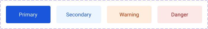
Buttons can have different variants, such as primary and secondary, for main actions on a website. There can also be variants like warning or danger, which are supposed to make a user cautious about the action they are about to undertake. There are multiple ways in which variants can be implemented. I want to share with you how this can be achieved in an efficient and clean manner using CSS variables and modules.
In this tutorial, we are going to cover:
- How to create Button and Tag components with variants based on a design system.
- How to take advantage of CSS variables and CSS modules to implement component variants.
- How to share variant styles between multiple components using a VariantStyleProvider component.
Project setup
You can find the GitHub repository with a full code example here. I have used Vite to scaffold a new project for this tutorial. If you would like to follow this tutorial, you can create a new project with Vite by running one of the commands shown below:
With NPM:
$ npm init @vitejs/app
With Yarn:
$ yarn create @vitejs/app
After creating the project, install dependencies and start the dev server.
Let's start with creating a new BaseButton.vue component.
src/components/BaseButton.vue
<template>
  <button :class="[$style.baseButton]" v-bind="$attrs">
    <slot />
  </button>
</template>

<script>
export default {
  props: {
    variant: {
      type: String,
      validators: value =>
        ['primary', 'secondary', 'warning', 'danger'].includes(value),
    },
  },
}
</script>

<style module>
.baseButton {
  border: none;
  background: transparent;
  padding: 0.6rem 1rem;
}
</style>
It's a very simple component that has one prop only - variant. Now, let's replace the content of the App.vue component and add four buttons for each variant.
src/App.vue
<template>
  <div :class="$style.container">
    <BaseButton variant="primary"> Primary </BaseButton>
    <BaseButton variant="secondary"> Secondary </BaseButton>
    <BaseButton variant="warning"> Warning </BaseButton>
    <BaseButton variant="danger"> Danger </BaseButton>
  </div>
</template>

<script>
import BaseButton from './components/BaseButton.vue'
export default {
  components: {
    BaseButton,
  },
}
</script>

<style module>
.container {
  width: 300px;
  margin: 2rem auto;
  display: grid;
  gap: 1.5rem;
  grid-template-columns: repeat(4, 1fr);
  justify-content: center;
}
</style>
As you can see above, we render four BaseButton components for each variant: primary, secondary, warning, and danger.
Below is an image showing how the buttons should look like at the moment. The primary one is focused, so there is a default outline colour shown.
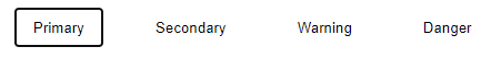
I know it's nothing fancy yet, but we will get there. We have a basic setup, so let's add CSS variables and styles for each of the variants in the BaseButton component. Note that we are not using scoped styles (<style scoped>). Instead, we use CSS modules: <style module>. Any styles defined this way are exposed to the component under the $style property.
CSS variables and BaseButton component variants
First, create a new file called variables.css and add the CSS variables shown below.
src/styles/variables.css
:root {
  --primary-text-color: #eff6ff;
  --primary-bg-color: #1d4ed8;
  --secondary-text-color: #1d4ed8;
  --secondary-bg-color: #eff6ff;
  --warning-text-color: #c2410c;
  --warning-bg-color: #fff7ed;
  --danger-text-color: #b91c1c;
  --danger-bg-color: #fee2e2;
}
Import the variables.css file in the main.js file, as the components in the application will need to be able to access them.
src/main.js
import { createApp } from 'vue'
import './styles/variables.css'
import App from './App.vue'

createApp(App).mount('#app')
Next, we need to update the BaseButton component. There are three things we need to do:
- Add a variant style based on the
variantprop. - Add
colorandbackground-colorproperties to thebaseButtonclass. - Add CSS variables for each variant class.
src/components/BaseButton.vue
First, change classes that are passed to the button element. Besides the baseButton class, it should also receive an appropriate variant class. This class will be determined by the variant prop.
<template>
  <button :class="[$style.baseButton, $style[variant]]" v-bind="$attrs">
    <slot />
  </button>
</template>
Next, we add color and background-color properties to the baseButton class. These properties will have --btn-text-color and --btn-bg-color variables for values. These will be set by each variant class and will correspond to the CSS variables defined in the variables.css file.
<style module>
.baseButton {
  border: none;
  padding: 0.6rem 1rem;
  color: var(--btn-text-color);
  background-color: var(--btn-bg-color);
}

.primary {
  --btn-text-color: var(--primary-text-color);
  --btn-bg-color: var(--primary-bg-color);
}

.secondary {
  --btn-text-color: var(--secondary-text-color);
  --btn-bg-color: var(--secondary-bg-color);
}

.warning {
  --btn-text-color: var(--warning-text-color);
  --btn-bg-color: var(--warning-bg-color);
}

.danger {
  --btn-text-color: var(--danger-text-color);
  --btn-bg-color: var(--danger-bg-color);
}
</style>
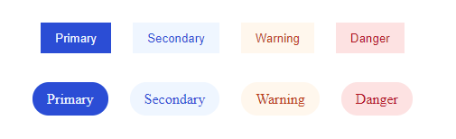
Great, each button rendered by the App.vue component should now have appropriate colours applied, as shown in the image below.

If you would like, you can add more variables for different states, such as hover, active, or disabled.
We have achieved the first objective. We now have a button component that supports multiple variants. But what if we need to create another component that also should have support for the same variants? For instance, a tag component? Let's have a look at how we can handle it.
BaseTag component with variants
Let's start with creating a BaseTag.vue component and updating the App.vue component to render tags for each variant.
src/components/BaseTag.vue
<template>
  <div :class="[$style.baseTag, $style[variant]]" v-bind="$attrs">
    <slot />
  </div>
</template>

<script>
export default {
  props: {
    variant: {
      type: String,
      validators: value =>
        ['primary', 'secondary', 'warning', 'danger'].includes(value),
    },
  },
}
</script>

<style module>
.baseTag {
  border: none;
  border-radius: 1.5rem;
  padding: 0.6rem 1rem;
  color: var(--tag-text-color);
  background: var(--tag-bg-color);
}

.primary {
  --tag-text-color: var(--primary-text-color);
  --tag-bg-color: var(--primary-bg-color);
}

.secondary {
  --tag-text-color: var(--secondary-text-color);
  --tag-bg-color: var(--secondary-bg-color);
}

.warning {
  --tag-text-color: var(--warning-text-color);
  --tag-bg-color: var(--warning-bg-color);
}

.danger {
  --tag-text-color: var(--danger-text-color);
  --tag-bg-color: var(--danger-bg-color);
}
</style>
src/App.vue
<template>
  <div :class="$style.container">
    <BaseButton variant="primary"> Primary </BaseButton>
    <BaseButton variant="secondary"> Secondary </BaseButton>
    <BaseButton variant="warning"> Warning </BaseButton>
    <BaseButton variant="danger"> Danger </BaseButton>
  </div>
  <div :class="$style.container">
    <BaseTag variant="primary"> Primary </BaseTag>
    <BaseTag variant="secondary"> Secondary </BaseTag>
    <BaseTag variant="warning"> Warning </BaseTag>
    <BaseTag variant="danger"> Danger </BaseTag>
  </div>
</template>

<script>
import BaseButton from './components/BaseButton.vue'
import BaseTag from './components/BaseTag.vue'
export default {
  components: {
    BaseButton,
    BaseTag,
  },
}
</script>
After these updates, you should see four buttons and four tags on the screen, as shown in the image below.
It works, right? However, did you spot how similar BaseButton and BaseTag components are? They are almost the same, and we have quite a bit of code duplication for styles. There is also a different problem. What if we would have more than two components with variants, let's say twenty, and then later on we would need to introduce more variants or update existing ones to different CSS variables? Every single component that has variants would need to be updated separately. We can solve these problems by taking variant styles out of the BaseButton and BaseTag components. Instead, we are going to create a new component that will manage variants and pass appropriate styles via slots.
How to share variant styles with a VariantStyleProvider component
A really great thing about CSS modules is that we can easily pass and compose styles. That's exactly what we will do now. Starting with creating a new component called VariantStyleProvider.vue. This component will do 3 things:
- Accept a
variantprop - Define variant styles for
colorandbackground-colorproperties - Render a slot and pass
baseVariantand an appropriatevariantclass to it.
src/components/VariantStyleProvider.vue
<template>
  <slot :variantStyle="[$style.baseVariant, $style[variant]]" />
</template>

<script>
export default {
  props: {
    variant: {
      type: String,
      validators: value =>
        ['primary', 'secondary', 'warning', 'danger'].includes(value),
    },
  },
}
</script>

<style module>
.baseVariant {
  color: var(--variant-text-color);
  background-color: var(--variant-bg-color);
}

.primary {
  --variant-text-color: var(--primary-text-color);
  --variant-bg-color: var(--primary-bg-color);
}

.secondary {
  --variant-text-color: var(--secondary-text-color);
  --variant-bg-color: var(--secondary-bg-color);
}

.warning {
  --variant-text-color: var(--warning-text-color);
  --variant-bg-color: var(--warning-bg-color);
}

.danger {
  --variant-text-color: var(--danger-text-color);
  --variant-bg-color: var(--danger-bg-color);
}
</style>
Due to the fact that the VariantStyleProvider component is now handling variant styles, we will be able to remove them from the BaseButton and BaseTag components. Besides removing the styles, we also need to import the VariantStyleProvider and use the variantStyle that is passed from it. Below you can see the final versions of both components.
src/components/BaseButton.vue
<template>
  <VariantStyleProvider :variant="variant">
    <template #default="{ variantStyle }">
      <button :class="[$style.baseButton, variantStyle]" v-bind="$attrs">
        <slot />
      </button>
    </template>
  </VariantStyleProvider>
</template>

<script>
import VariantStyleProvider from './VariantStyleProvider.vue'

export default {
  components: {
    VariantStyleProvider,
  },
  props: {
    variant: {
      type: String,
      validators: value =>
        ['primary', 'secondary', 'warning', 'danger'].includes(value),
    },
  },
}
</script>

<style module>
.baseButton {
  border: none;
  padding: 0.6rem 1rem;
}
</style>
src/components/BaseTag.vue
<template>
  <VariantStyleProvider :variant="variant">
    <template #default="{ variantStyle }">
      <div :class="[$style.baseTag, variantStyle]" v-bind="$attrs">
        <slot />
      </div>
    </template>
  </VariantStyleProvider>
</template>

<script>
import VariantStyleProvider from './VariantStyleProvider.vue'

export default {
  components: {
    VariantStyleProvider,
  },
  props: {
    variant: {
      type: String,
      validators: value =>
        ['primary', 'secondary', 'warning', 'danger'].includes(value),
    },
  },
}
</script>

<style module>
.baseTag {
  border: none;
  border-radius: 1.5rem;
  padding: 0.6rem 1rem;
}
</style>
Both components are now much cleaner. We managed to remove unnecessary code duplication, as variant styles are managed in the VariantStyleProvider component. This pattern helps a lot with maintaining and extending variants. If you would need to update them or add new ones, you only have to focus on 2 files: variables.css and VariantStyleProvider.vue, instead of manually updating every single component where variants are used.
I hope you enjoyed this article. If you would like to learn more advanced patterns, techniques and best practices related to Vue, you might want to check out "Vue - The Road To Enterprise" book.