

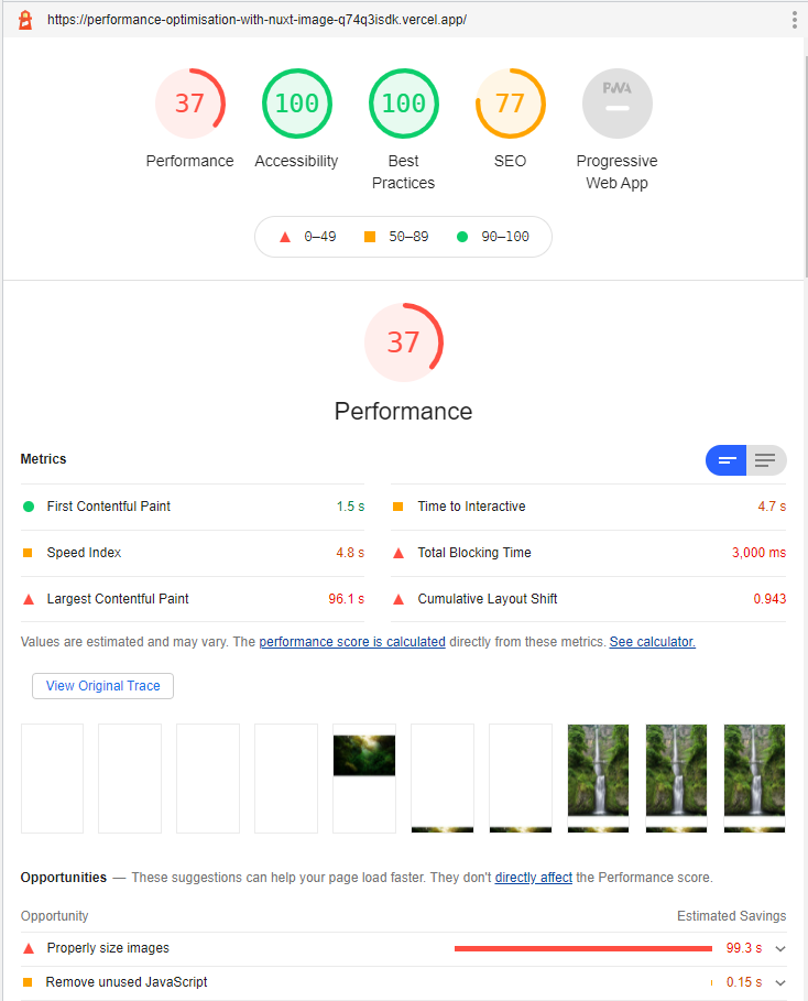
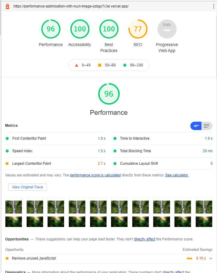
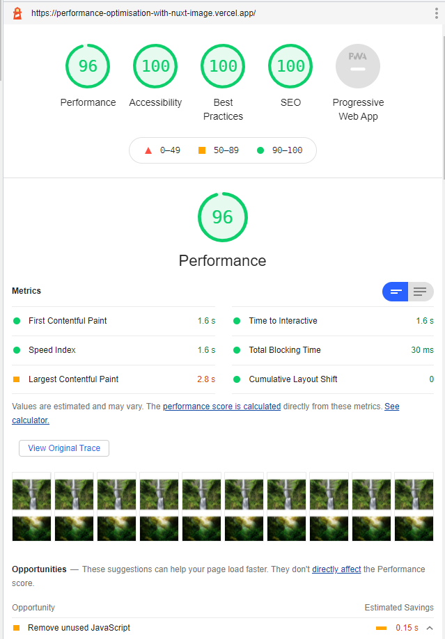
To optimize images in Nuxt 3, install @nuxt/image, swap <img> tags for <NuxtImg>, and pass the sizes, quality, and loading props. That alone took a demo page from a Lighthouse performance score of 37 to 96. This article walks through each step.
This guide is written for Nuxt 3 and @nuxt/image v1.
Project setup
Create a new Nuxt 3 project:
npx nuxi@latest init my-nuxt-image-app
cd my-nuxt-image-app
npm install
npm install @nuxt/image
Open nuxt.config.ts and register the module:
nuxt.config.ts
export default defineNuxtConfig({
  modules: ['@nuxt/image'],
})
Start the dev server with npm run dev.
Adding large images
Before optimizing anything, let's load some raw images to show the problem. I downloaded a few large photos from Unsplash. You can grab the ones used in this demo from this GitHub repository, or use your own large JPEGs.
pages/index.vue
<template>
  <div class="container">
    <img src="/images/waterfall.jpg" alt="waterfall" />
    <img src="/images/forest.jpg" alt="forest" />
    <img src="/images/hills.jpg" alt="hills" />
    <img src="/images/forest-hill.jpg" alt="forest-hill" />
    <img src="/images/island.jpg" alt="island" />
    <img src="/images/beach.jpg" alt="beach" />
    <img src="/images/lake.jpg" alt="lake" />
  </div>
</template>

<style>
.container {
  margin: 0 auto;
  min-height: 100vh;
  display: flex;
  justify-content: center;
  align-items: center;
  flex-direction: column;
  text-align: center;
  max-width: 1180px;
}

.container img {
  display: block;
  height: auto;
  max-width: 100%;
  object-fit: contain;
  margin-top: 4rem;
}
</style>
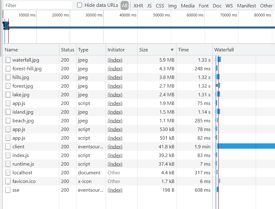
Check the network tab and the problem is obvious. The waterfall photo alone is 5.6 MB.
Run npx nuxi generate and deploy to a static host to get a Lighthouse reading. Performance score: 37.
NuxtImg
Replace the <img> tags with <NuxtImg>. The props are the same.
<NuxtImg src="/images/waterfall.jpg" alt="waterfall" />
<NuxtImg src="/images/forest.jpg" alt="forest" />
<NuxtImg src="/images/hills.jpg" alt="hills" />
<NuxtImg src="/images/forest-hill.jpg" alt="forest-hill" />
<NuxtImg src="/images/island.jpg" alt="island" />
<NuxtImg src="/images/beach.jpg" alt="beach" />
<NuxtImg src="/images/lake.jpg" alt="lake" />
Just switching the component trims the waterfall image from 5.6 MB to around 4.8 MB. It's something, but not enough yet.
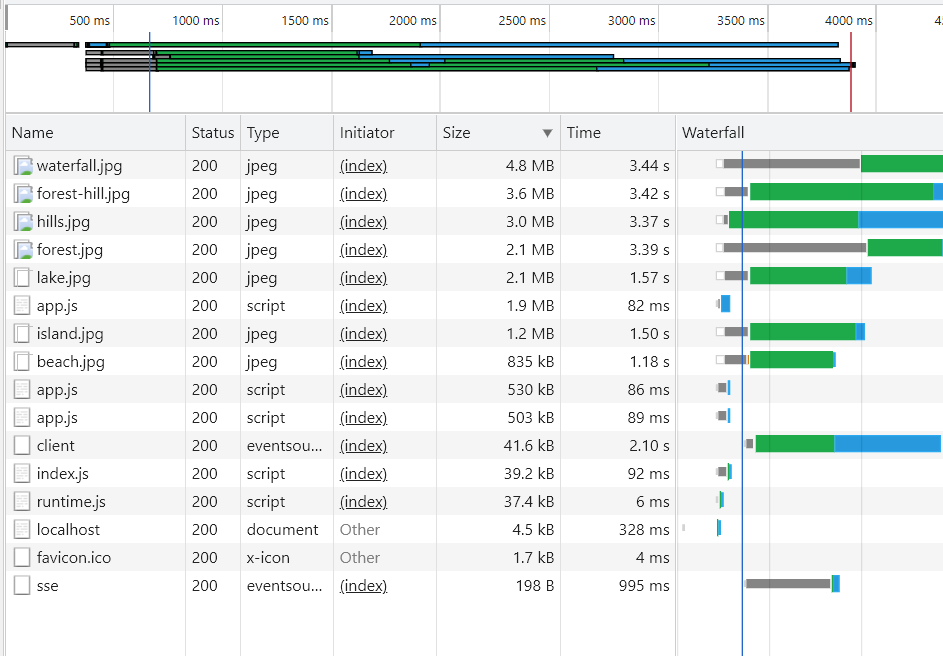
Image size and quality
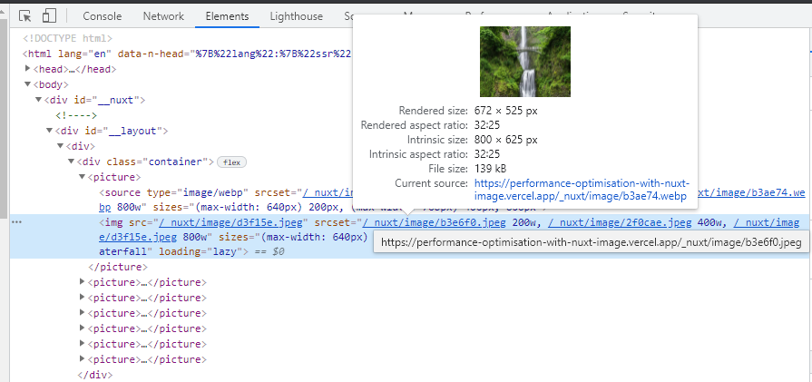
The sizes prop tells the module what widths to generate for different screen sizes. Without it, every device gets the full 4000x6000 px original.
<template>
  <div class="container">
    <NuxtImg
      sizes="200px sm:400px md:800px"
      src="/images/waterfall.jpg"
      alt="waterfall"
    />
    <NuxtImg
      sizes="200px sm:400px md:800px"
      src="/images/forest.jpg"
      alt="forest"
    />
    <NuxtImg
      sizes="200px sm:400px md:800px"
      src="/images/hills.jpg"
      alt="hills"
    />
    <NuxtImg
      sizes="200px sm:400px md:800px"
      src="/images/forest-hill.jpg"
      alt="forest-hill"
    />
    <NuxtImg
      sizes="200px sm:400px md:800px"
      src="/images/island.jpg"
      alt="island"
    />
    <NuxtImg
      sizes="200px sm:400px md:800px"
      src="/images/beach.jpg"
      alt="beach"
    />
    <NuxtImg
      sizes="200px sm:400px md:800px"
      src="/images/lake.jpg"
      alt="lake"
    />
  </div>
</template>
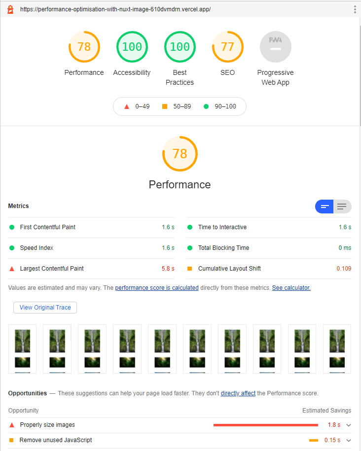
The waterfall image drops from 4.8 MB to 297 kB. Lighthouse jumps to 78.
Now add quality reduction and lazy loading:
<template>
  <div class="container">
    <NuxtImg
      sizes="200px sm:400px md:800px"
      src="/images/waterfall.jpg"
      alt="waterfall"
      loading="lazy"
      width="1024"
      height="800"
      quality="75"
    />
    <NuxtImg
      sizes="200px sm:400px md:800px"
      src="/images/forest.jpg"
      alt="forest"
      loading="lazy"
      width="1024"
      height="800"
      quality="75"
    />
    <NuxtImg
      sizes="200px sm:400px md:800px"
      src="/images/hills.jpg"
      alt="hills"
      loading="lazy"
      width="1024"
      height="800"
      quality="75"
    />
    <NuxtImg
      sizes="200px sm:400px md:800px"
      src="/images/forest-hill.jpg"
      alt="forest-hill"
      loading="lazy"
      width="1024"
      height="800"
      quality="75"
    />
    <NuxtImg
      sizes="200px sm:400px md:800px"
      src="/images/island.jpg"
      alt="island"
      loading="lazy"
      width="1024"
      height="800"
      quality="75"
    />
    <NuxtImg
      sizes="200px sm:400px md:800px"
      src="/images/beach.jpg"
      alt="beach"
      loading="lazy"
      width="1024"
      height="800"
      quality="75"
    />
    <NuxtImg
      sizes="200px sm:400px md:800px"
      src="/images/lake.jpg"
      alt="lake"
      loading="lazy"
      width="1024"
      height="800"
      quality="75"
    />
  </div>
</template>
Performance score: 96.
A few notes on these props:
quality="75" works well for photos. Below 70, compression artifacts start showing up on smooth gradients and skies. Above 85, the file size grows without much visible improvement.
Always provide width and height. The browser needs these to reserve space for the image before it loads. Without them, the page jumps when images arrive, which ruins the Cumulative Layout Shift (CLS) score.
Do not use loading="lazy" on the first visible image on screen. If that image is lazy-loaded, it delays the Largest Contentful Paint (LCP) and costs you performance points. Lazy load everything below the fold, not the hero.
NuxtPicture and modern image formats
<NuxtImg> serves the original file format. <NuxtPicture> wraps the output in a <picture> element and serves WebP or AVIF when the browser supports them, falling back to the original format for older browsers. The props are the same:
<NuxtPicture
  sizes="200px sm:400px md:800px"
  src="/images/waterfall.jpg"
  alt="waterfall"
  loading="lazy"
  width="1024"
  height="800"
  quality="75"
/>
Open the site in Chrome and the images will come through as .webp instead of .jpg.
Core Web Vitals
Image handling has a direct effect on two of the three Core Web Vitals scores.
Largest Contentful Paint (LCP) measures how long the largest visible element takes to load. If it's a large unoptimized photo, LCP will be slow. Use sizes and quality to reduce the payload. Skip loading="lazy" on the LCP image. Lazy-loading it is one of the more common performance mistakes.
Cumulative Layout Shift (CLS) measures unexpected page movement. Images without width and height cause layout shift because the browser has no idea how much space to reserve. Set both dimensions and this problem goes away.
Interaction to Next Paint (INP) is less directly related to images, though a 5 MB JPEG blocking the main thread will affect everything. Smaller images help across the board.
Lighthouse SEO score
After deploying with a robots.txt file and a <meta name="description"> tag, the SEO score reaches 100. Without them, even a fast page scores poorly on Lighthouse's SEO audit.
One thing worth knowing: Vercel preview deployments add a X-Robots-Tag: noindex header by default. If you're testing SEO scores from a Vercel preview URL, Lighthouse will report 77 no matter what your config says. Test from your production domain.
Frequently asked questions
If you want to go deeper on Nuxt and Vue patterns, check out the Vue - The Road To Enterprise book.